Overview
ZOA-UK (Zambia Orphans Aid UK) is a UK-based charity dedicated to improving the lives of vulnerable children in Zambia through education and long-term support. As the organisation was looking to modernise its image and increase its social media impact, I stepped in as the creative designer to guide its visual transformation.
ZOA-UK (Zambia Orphans Aid UK) is a UK-based charity dedicated to improving the lives of vulnerable children in Zambia through education and long-term support. As the organisation was looking to modernise its image and increase its social media impact, I stepped in as the creative designer to guide its visual transformation.
My Role
As the acting creative designer, I’ve been collaborating closely with ZOA-UK on its rebranding journey. I worked on helping reshaping its visual identity to reflect the charity’s mission more clearly and connect with wider audiences. My work bridges strategy and storytelling, with a focus on clarity, empathy, and impact.
As the acting creative designer, I’ve been collaborating closely with ZOA-UK on its rebranding journey. I worked on helping reshaping its visual identity to reflect the charity’s mission more clearly and connect with wider audiences. My work bridges strategy and storytelling, with a focus on clarity, empathy, and impact.

The goal
The aim of the rebranding is to enhance engagement and recognition using a more strategic visual identity in order to attract donors, supporters and new partners. By refreshing the visual and messaging strategy, the charity can better communicate their mission and make a lasting impact.
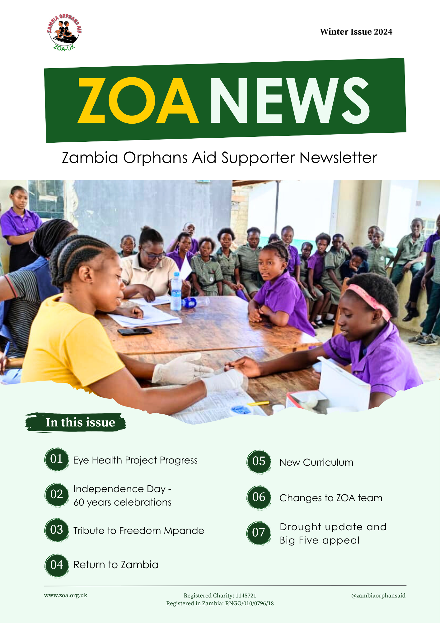
I supported the creation of digital and print materials and contributed to the visual rebranding for ZOA-UK by designing a wide range of assets including: infographics, videos, brochures, workbooks, newsletters, annual reports, posters, social media templates, web visuals.
The aim of the rebranding is to enhance engagement and recognition using a more strategic visual identity in order to attract donors, supporters and new partners. By refreshing the visual and messaging strategy, the charity can better communicate their mission and make a lasting impact.
I supported the creation of digital and print materials and contributed to the visual rebranding for ZOA-UK by designing a wide range of assets including: infographics, videos, brochures, workbooks, newsletters, annual reports, posters, social media templates, web visuals.
Social Media designs
Before:
ZOA-UK’s posts lacked consistency in layout, colours, and messaging. The visuals felt disconnected from the charity’s mission, making it harder to build recognition or engage effectively with followers
ZOA-UK’s posts lacked consistency in layout, colours, and messaging. The visuals felt disconnected from the charity’s mission, making it harder to build recognition or engage effectively with followers
After:
While the brand identity is currently in development, I moved forward by introducing a different visual language, clean typography, clear hierarchy, accessible colours. We decided to focus on visuals that are structured to tell a story. Each post reinforces the charity's message while having a more modern approach, including call to action messages, driving awareness, engagement, and trust.
While the brand identity is currently in development, I moved forward by introducing a different visual language, clean typography, clear hierarchy, accessible colours. We decided to focus on visuals that are structured to tell a story. Each post reinforces the charity's message while having a more modern approach, including call to action messages, driving awareness, engagement, and trust.

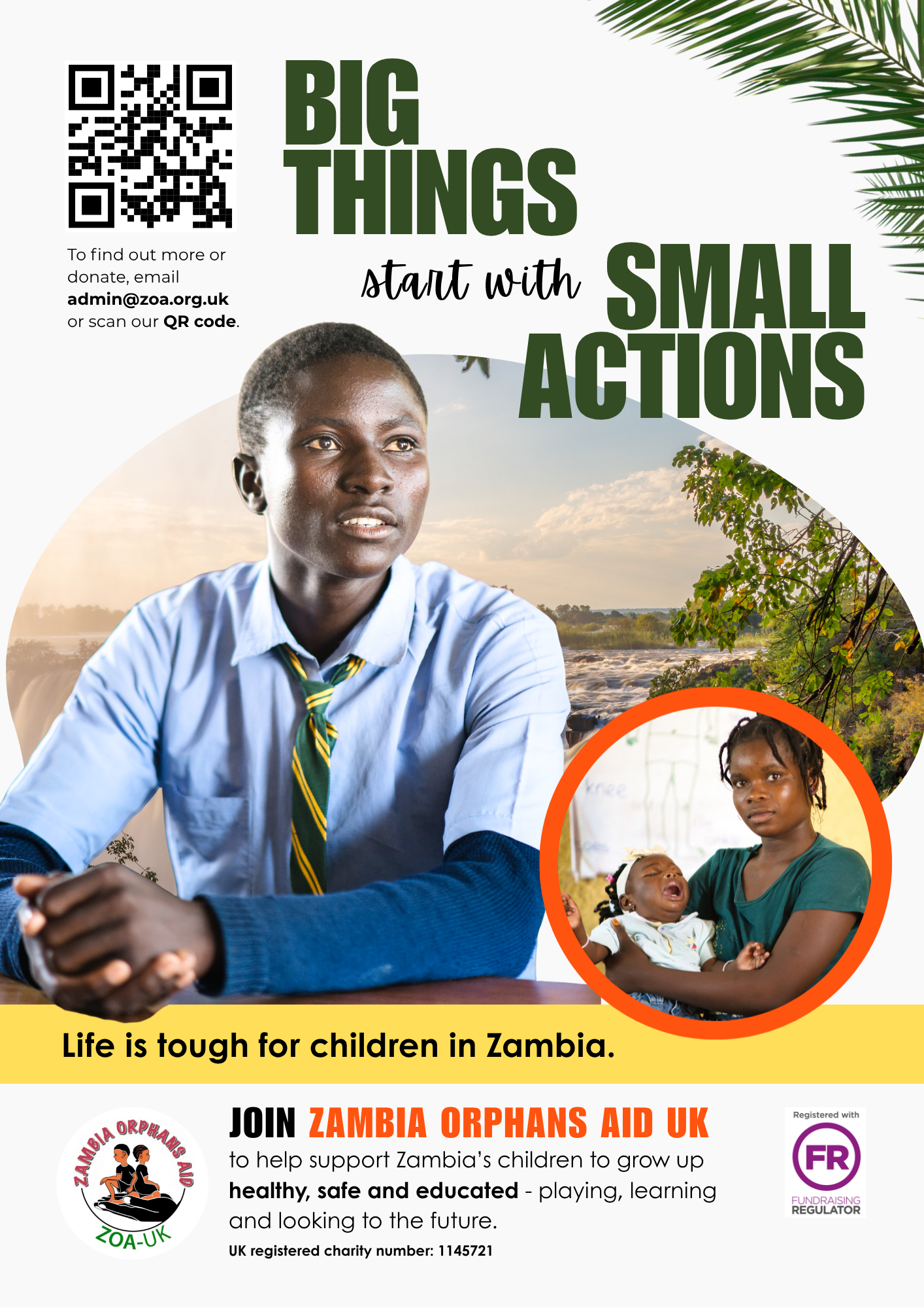
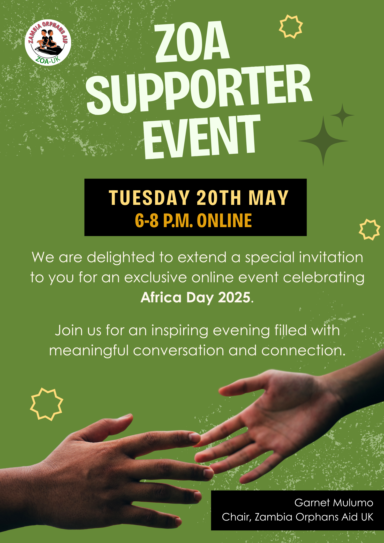
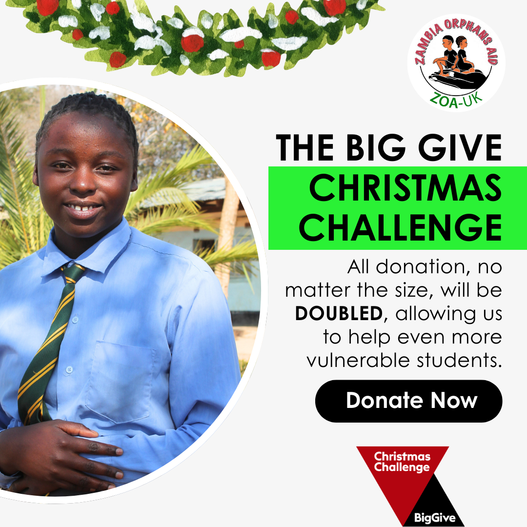
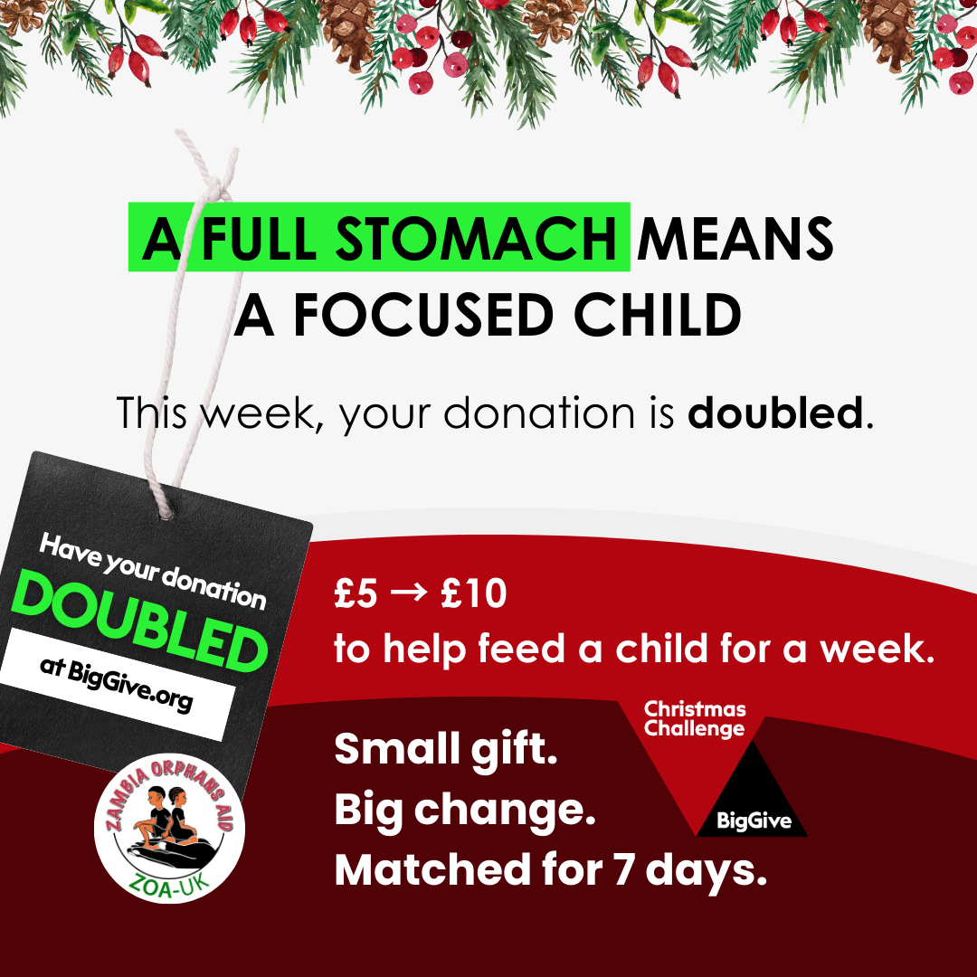
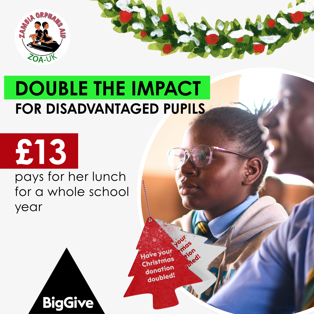
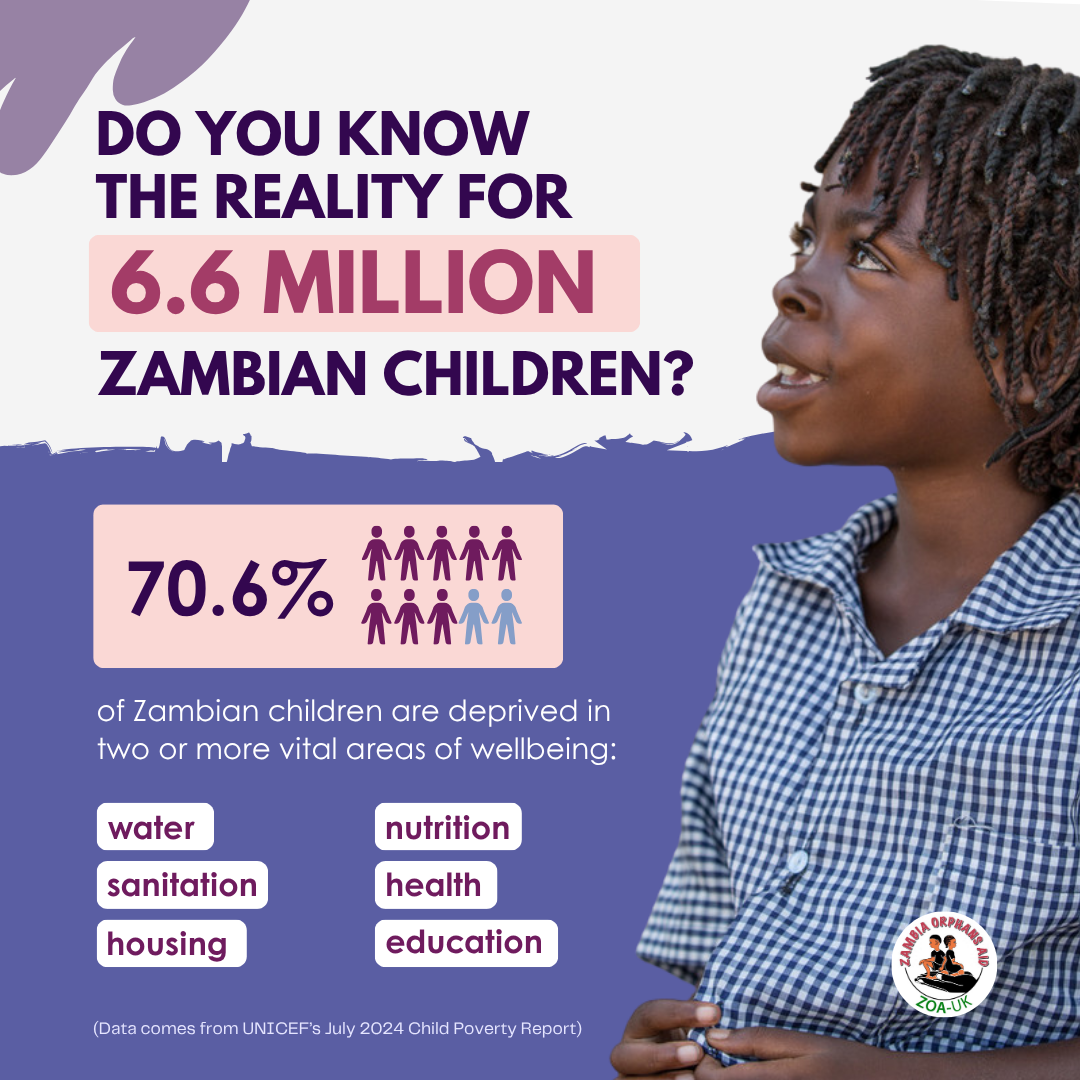
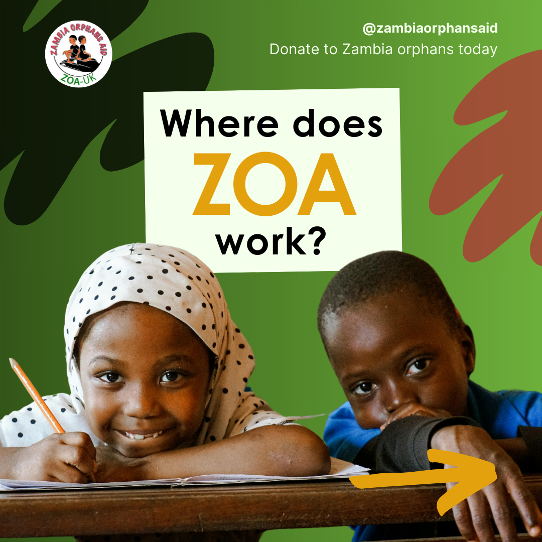
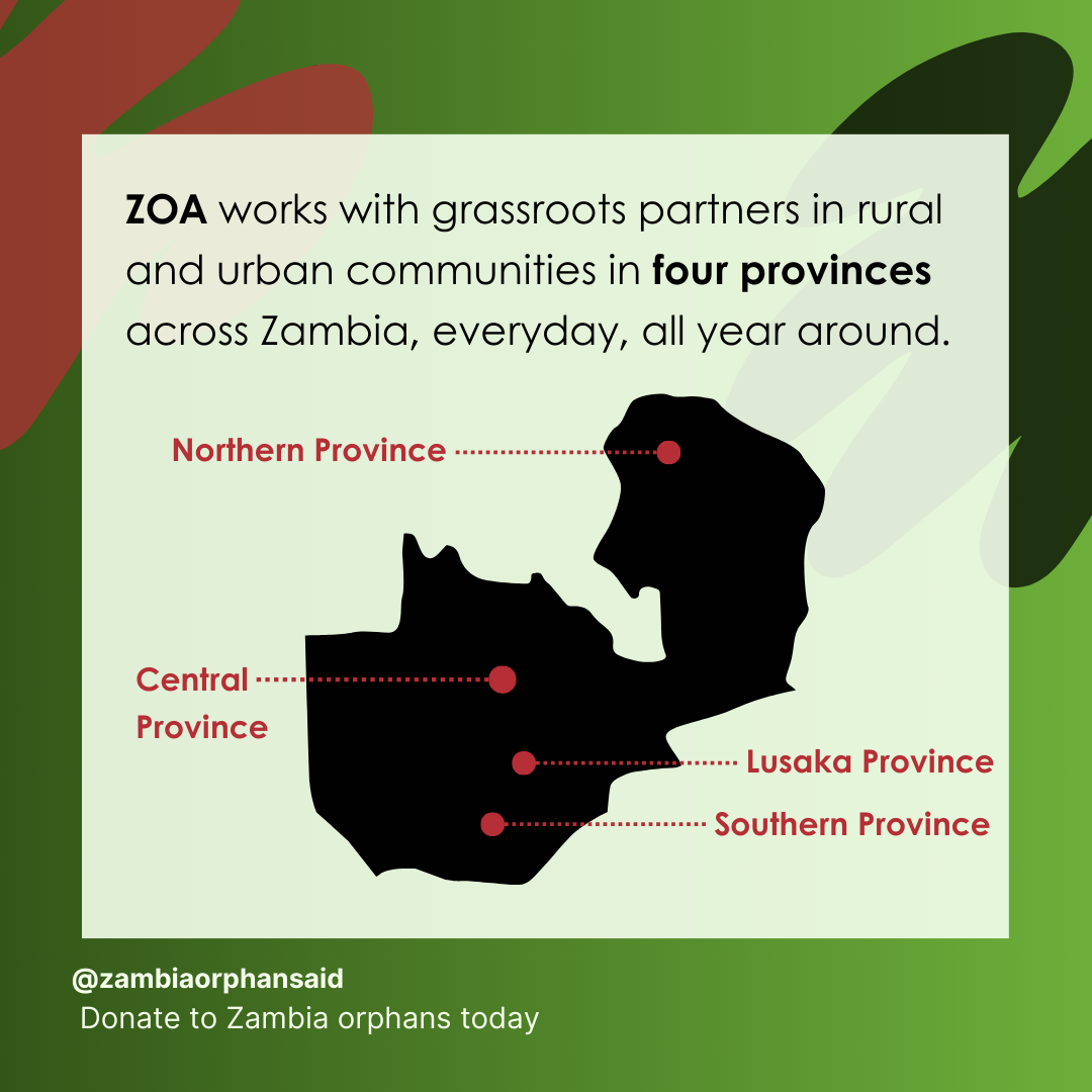
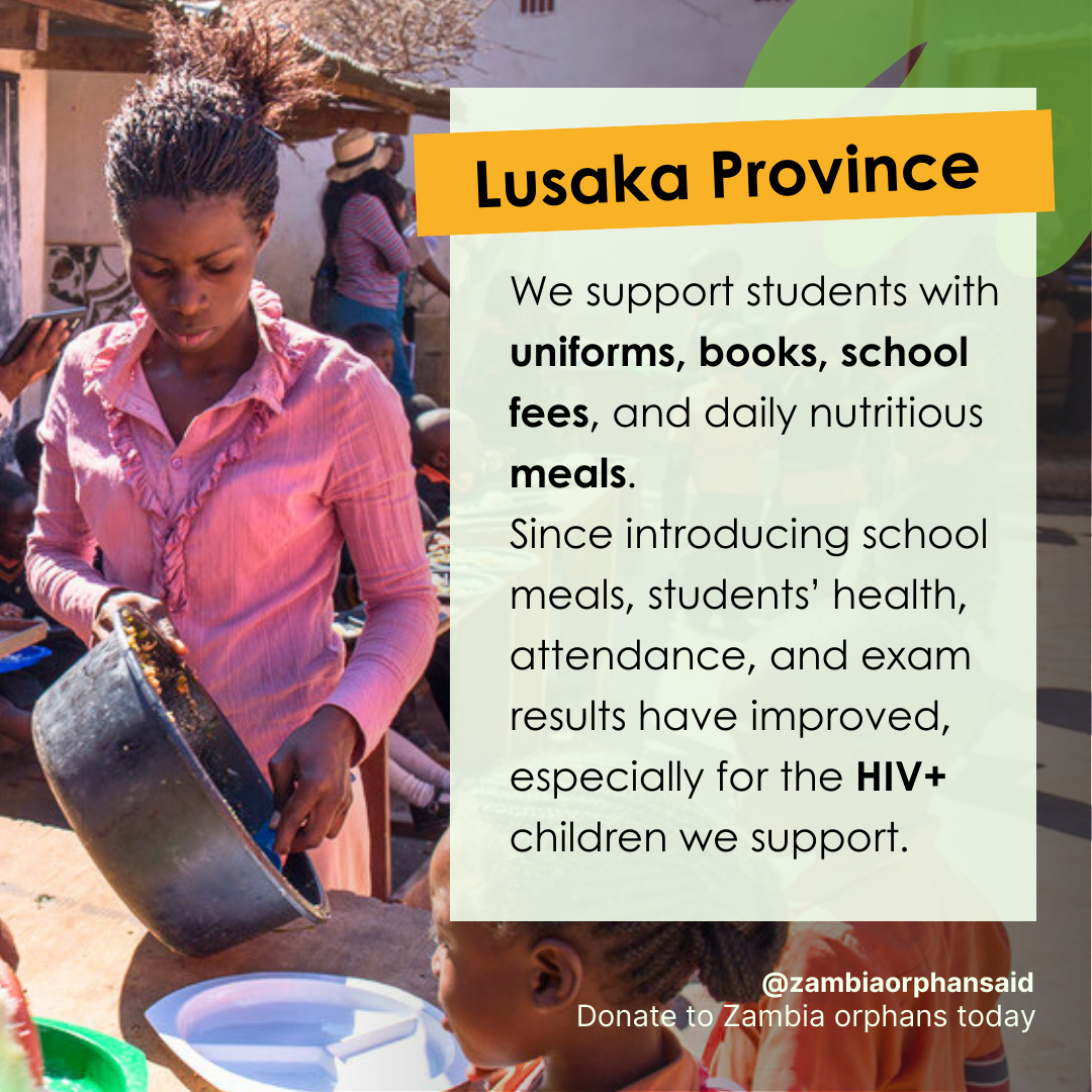
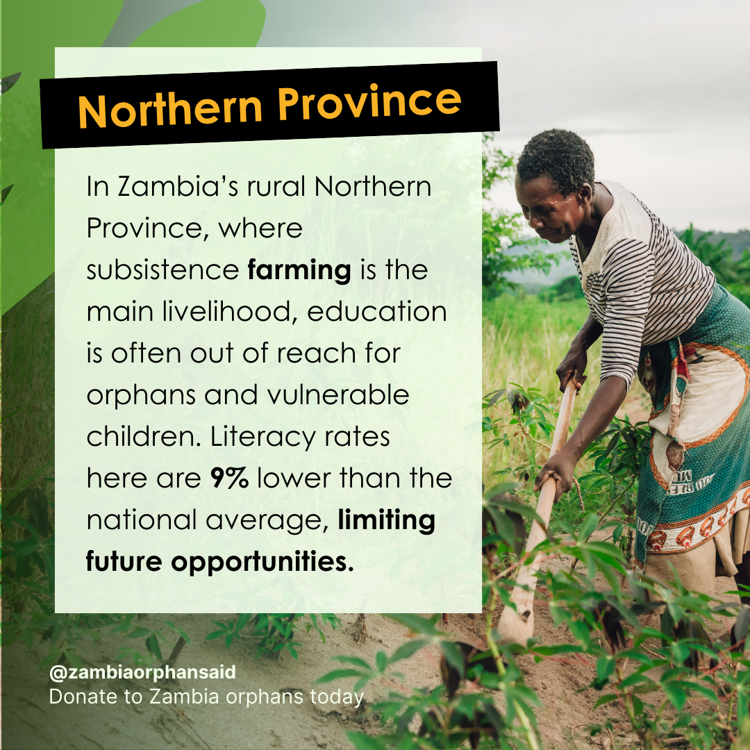
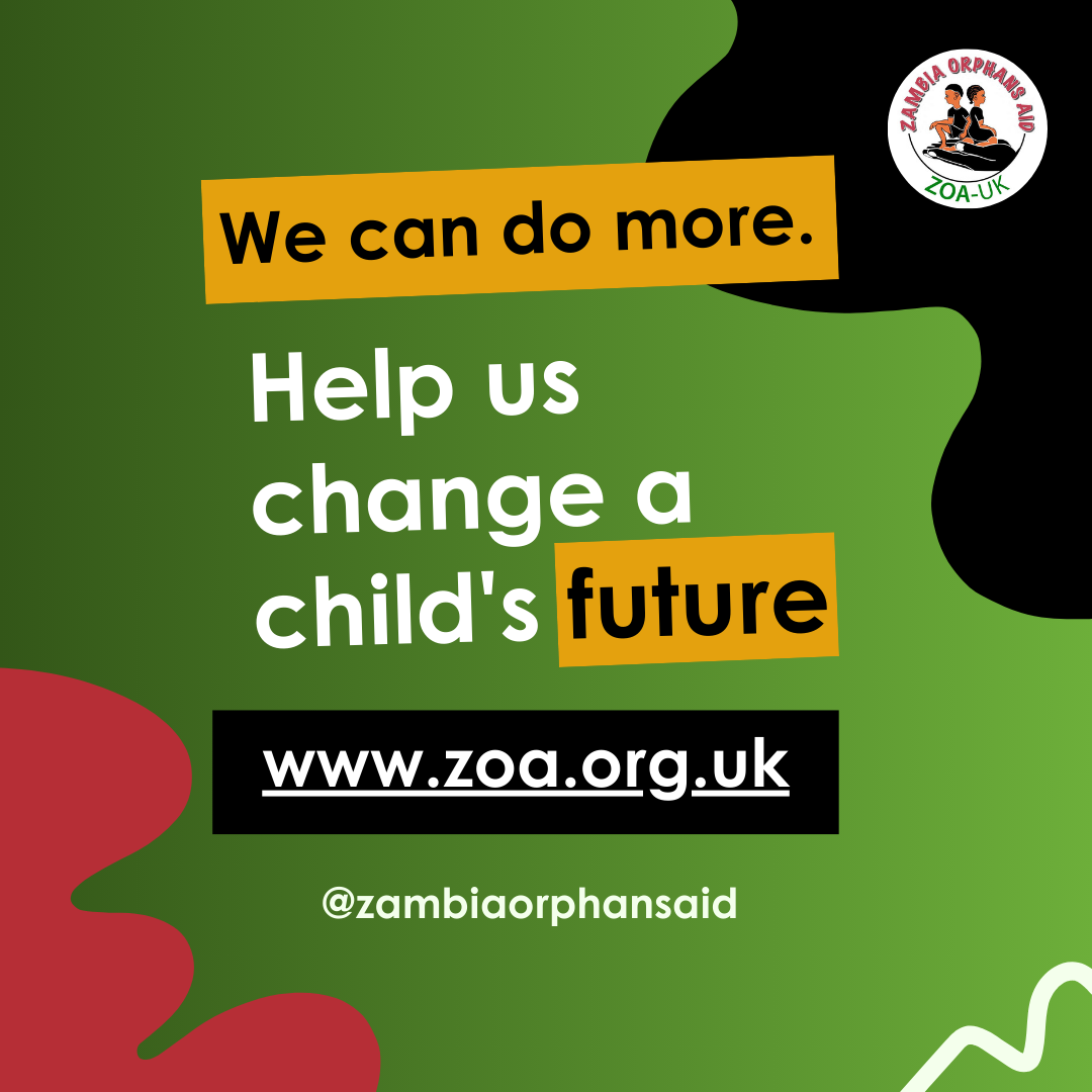
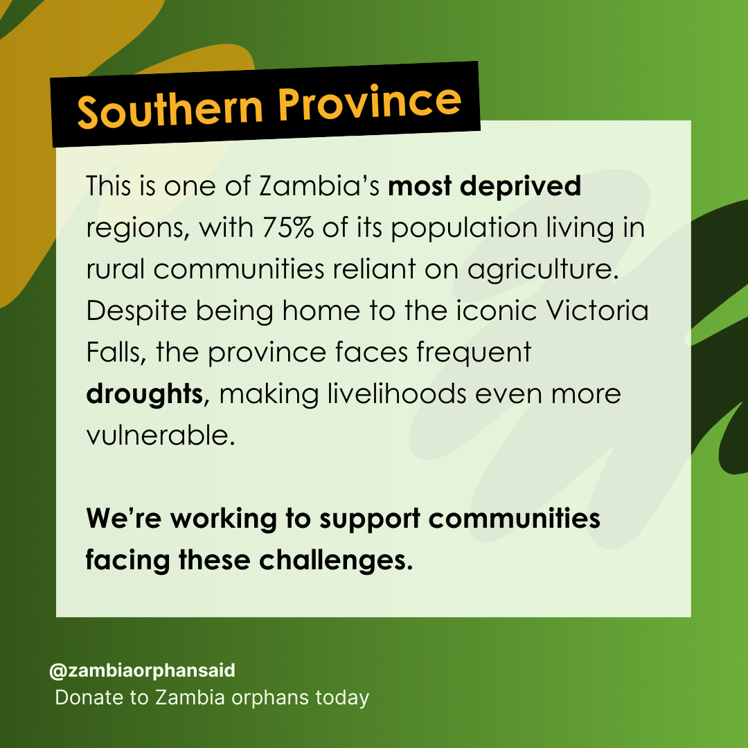
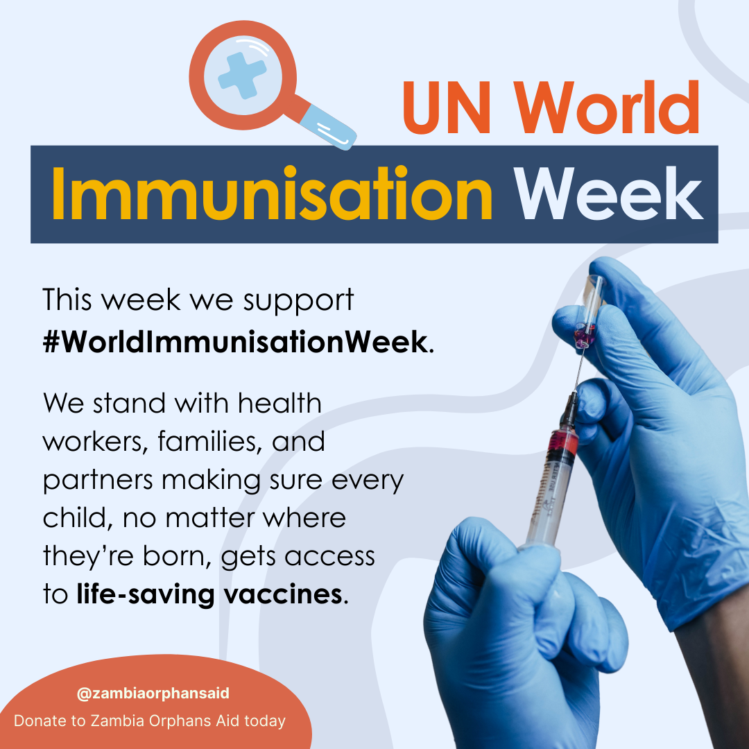
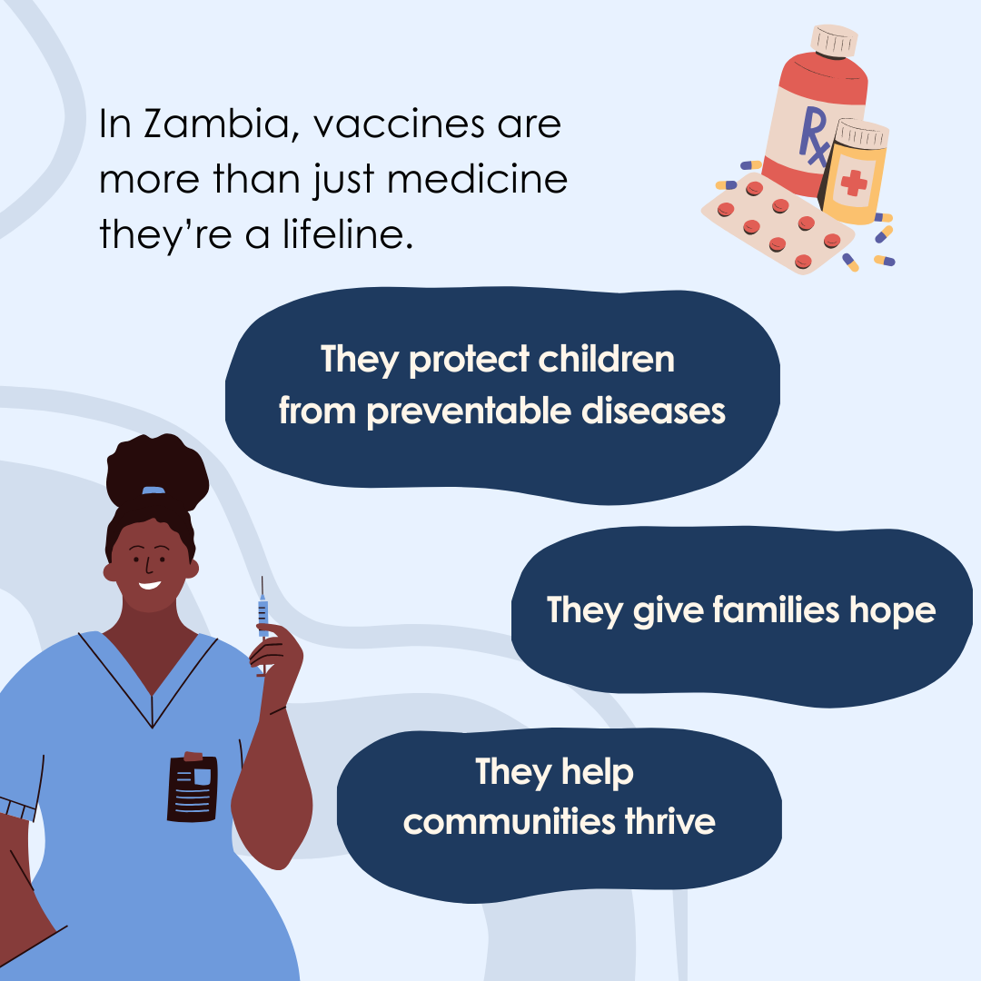
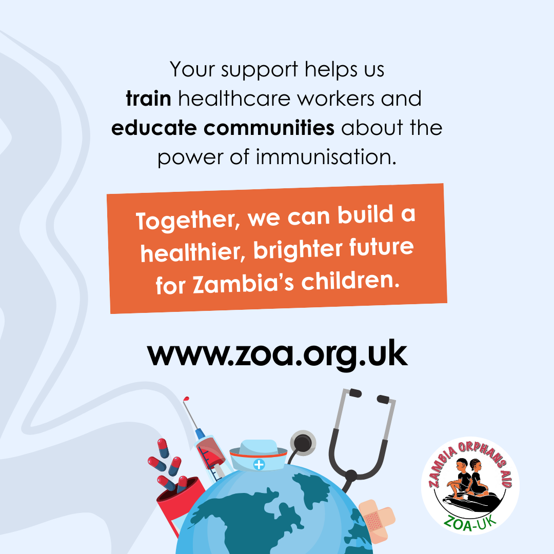
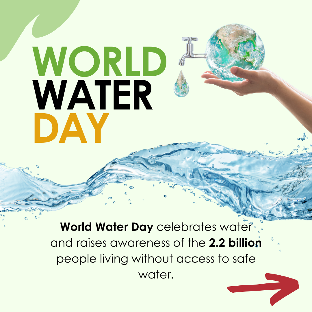
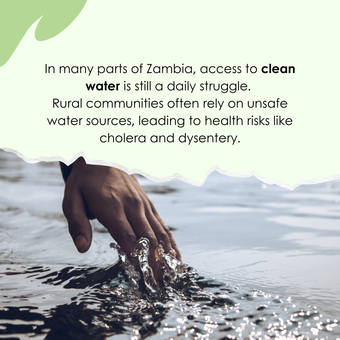
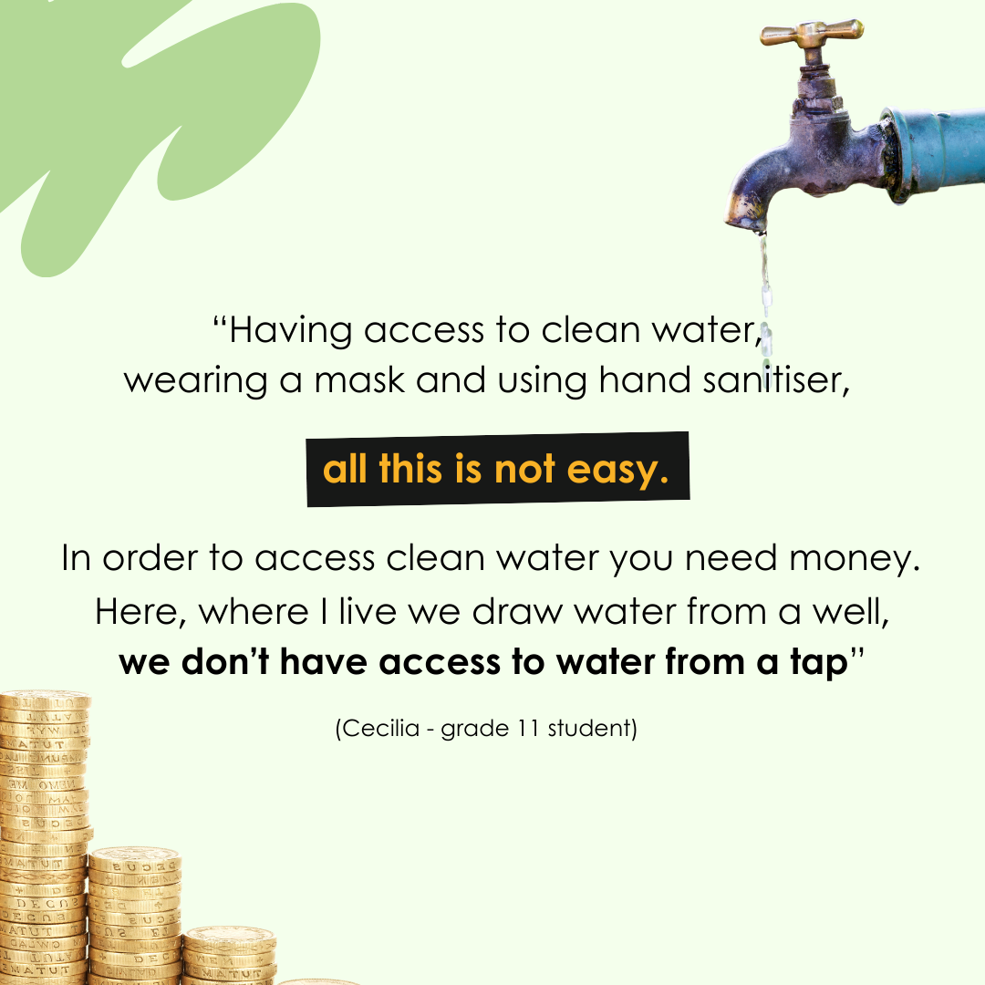
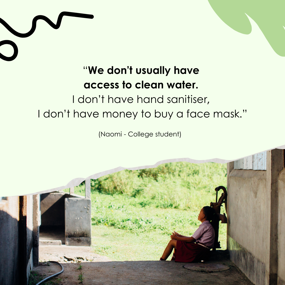
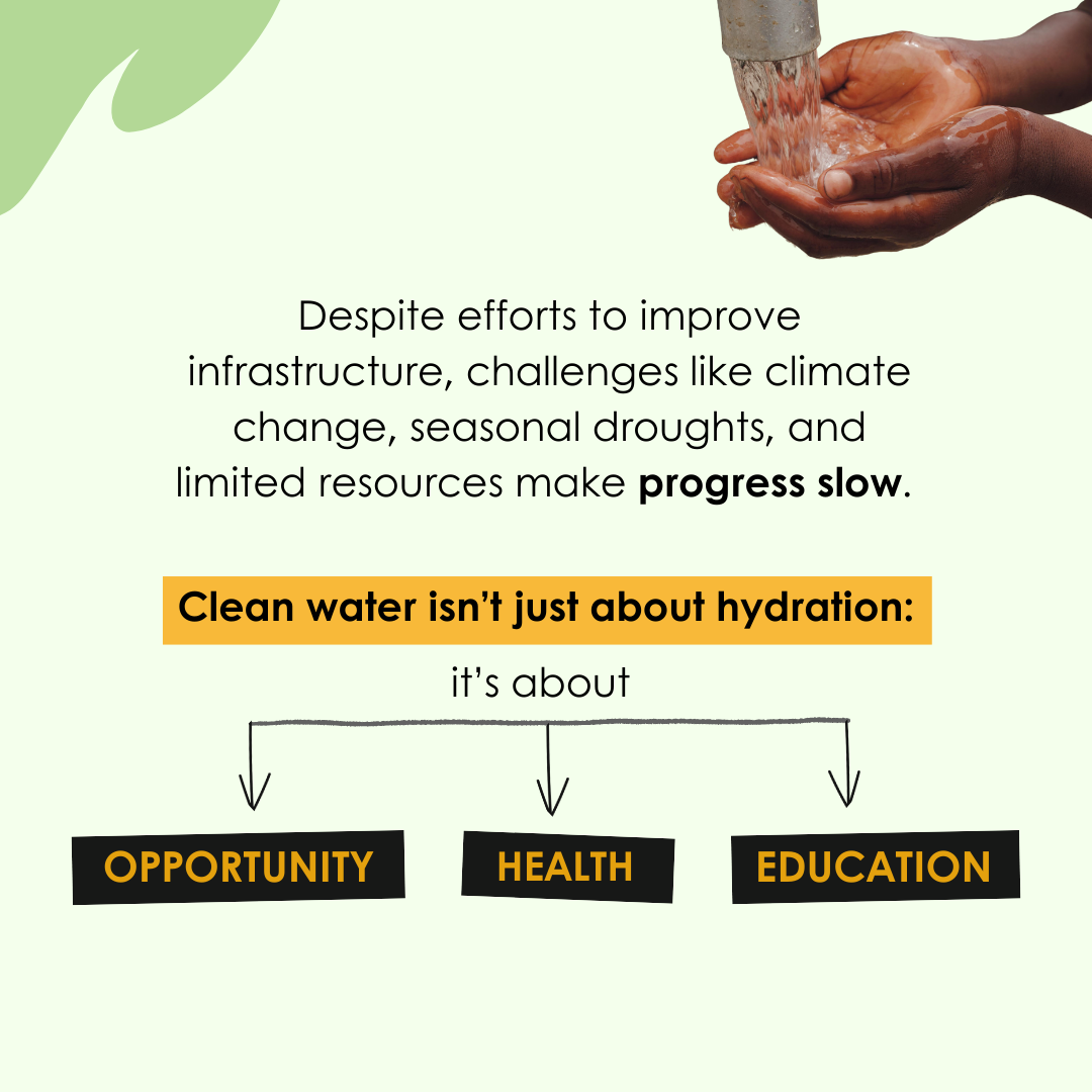
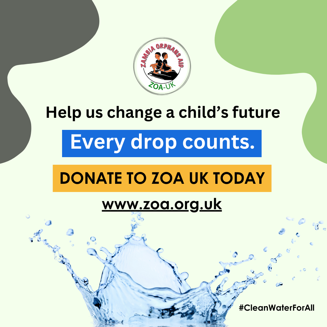
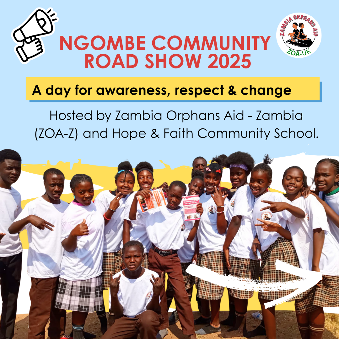
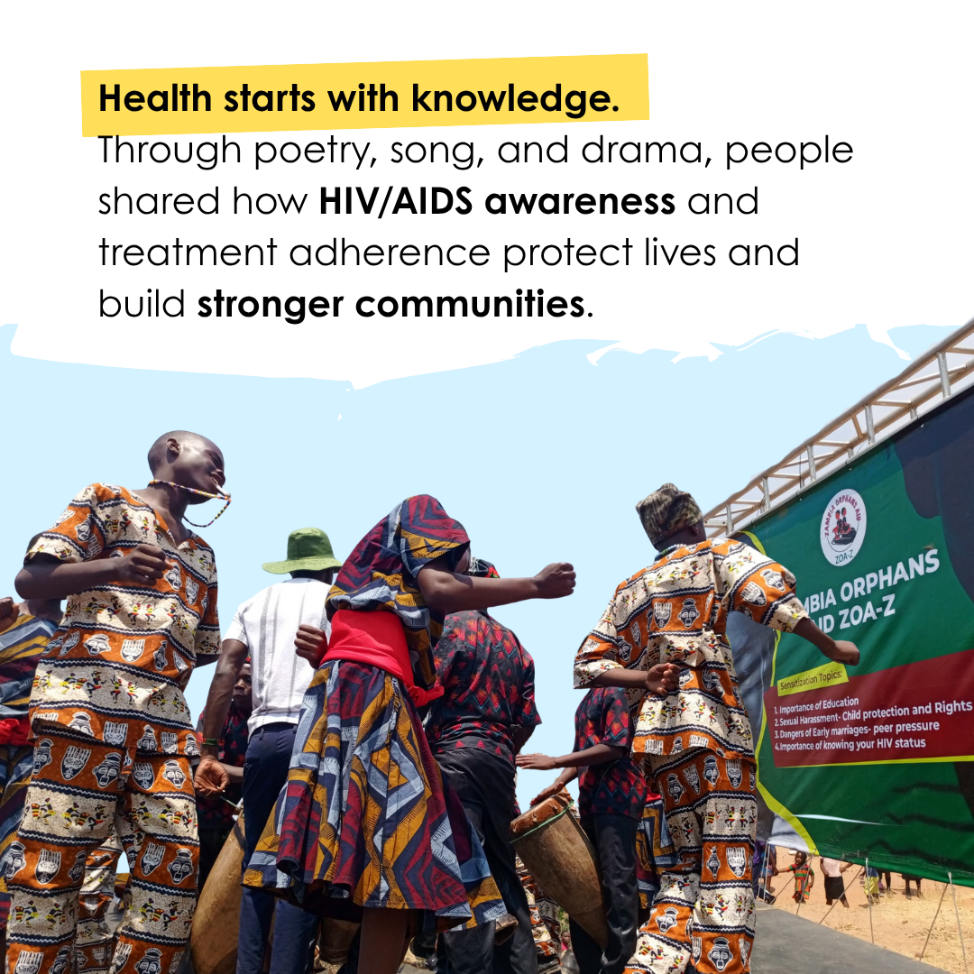
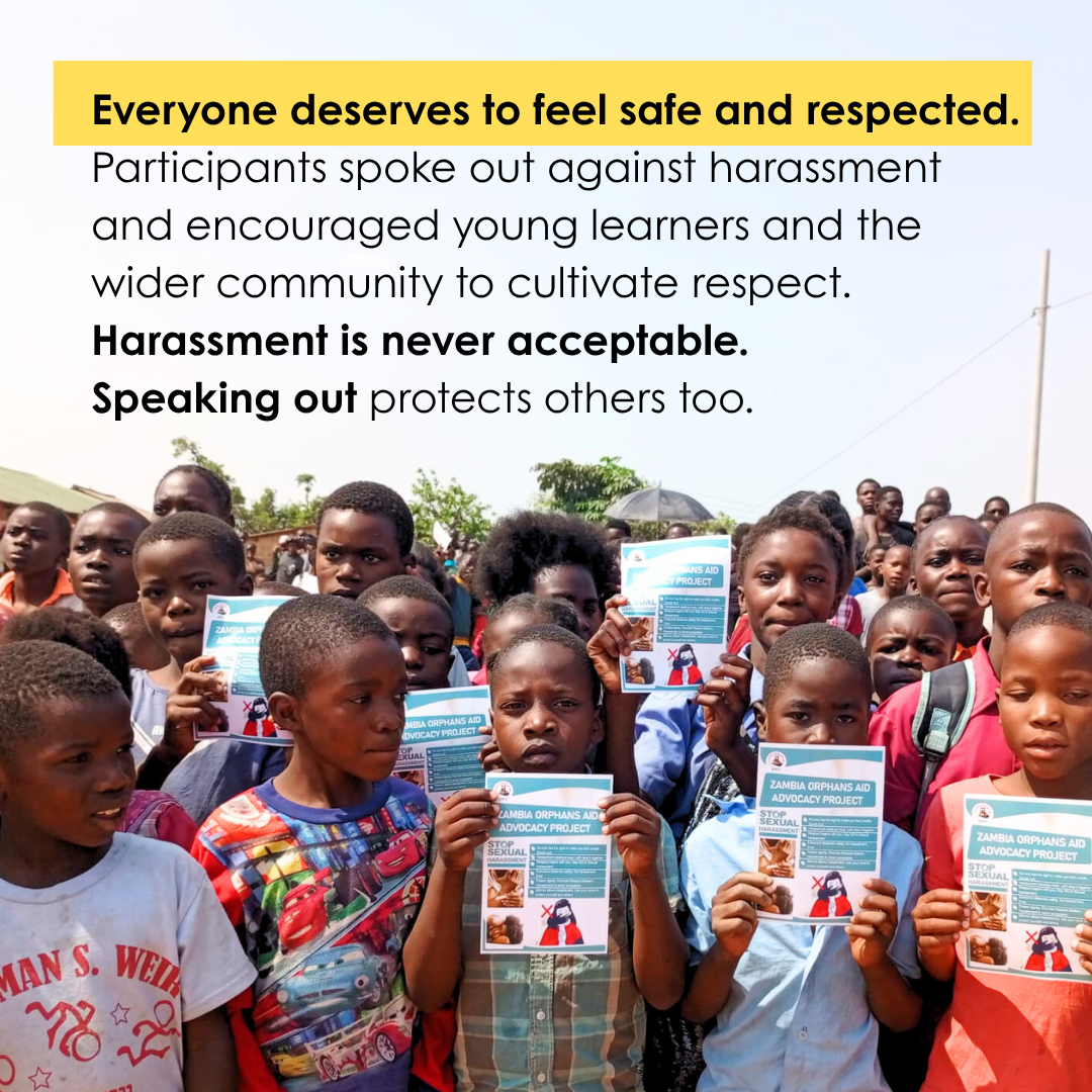
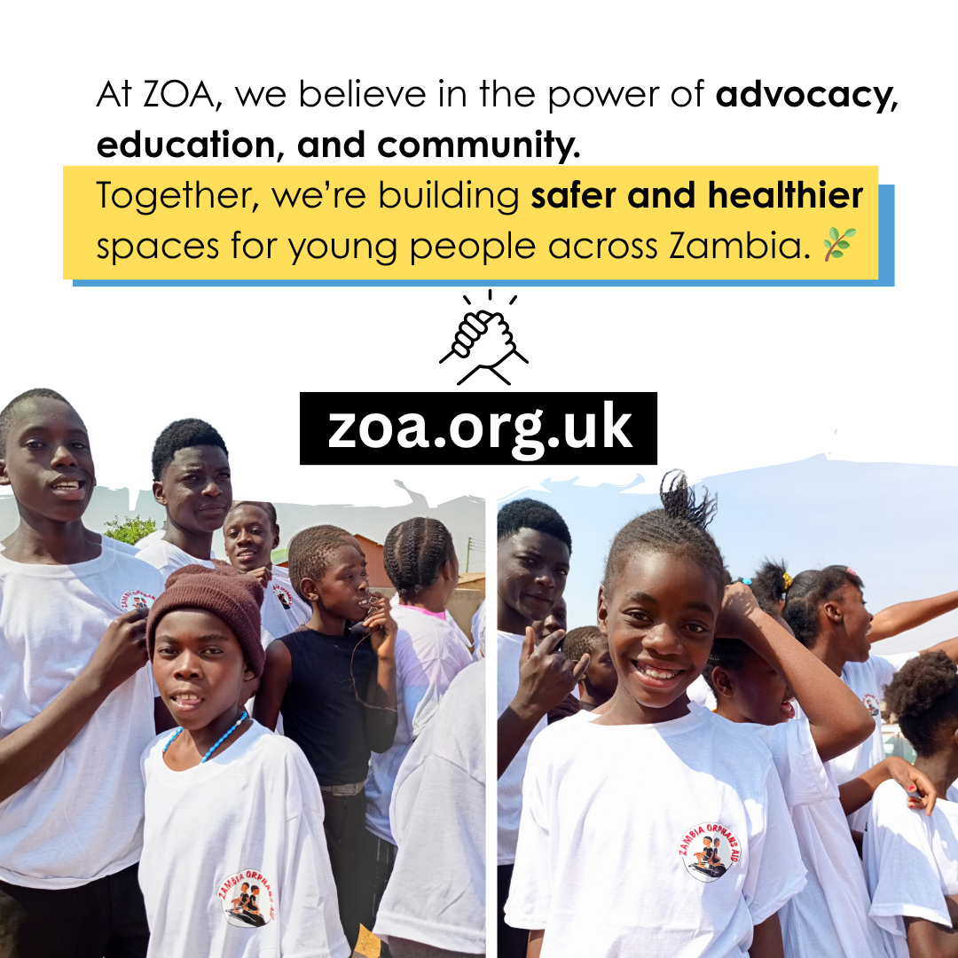
A few examples of new social media design suggested for a new visual identity.


ZOA-UK logo proposal: concept design
While still in development, this concept was created as an example of how the visual identity could evolve, communicating ZOA’s values with clarity, warmth, and purpose.
This proposed logo builds from the letter “O,” featuring a growing tree with three children reaching upward: it's symbolising hope, growth, and the impact of education. It reflects ZOA-UK’s mission to support vulnerable children combining warmth and clarity. I designed it to convey a message of empowerment and opportunity.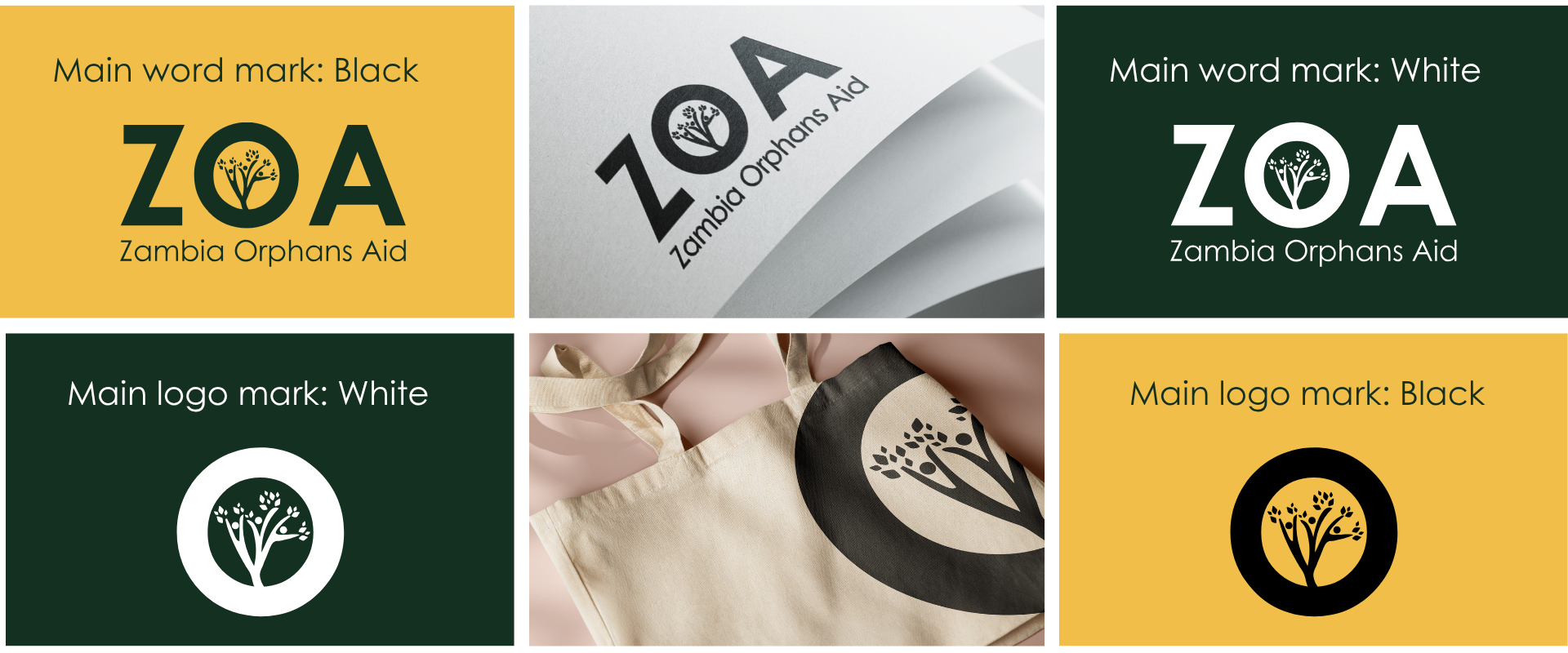
We are actively collaborating with stakeholders to finalise the brand guidelines. This section will be updated and uploaded as soon as the final materials are approved.
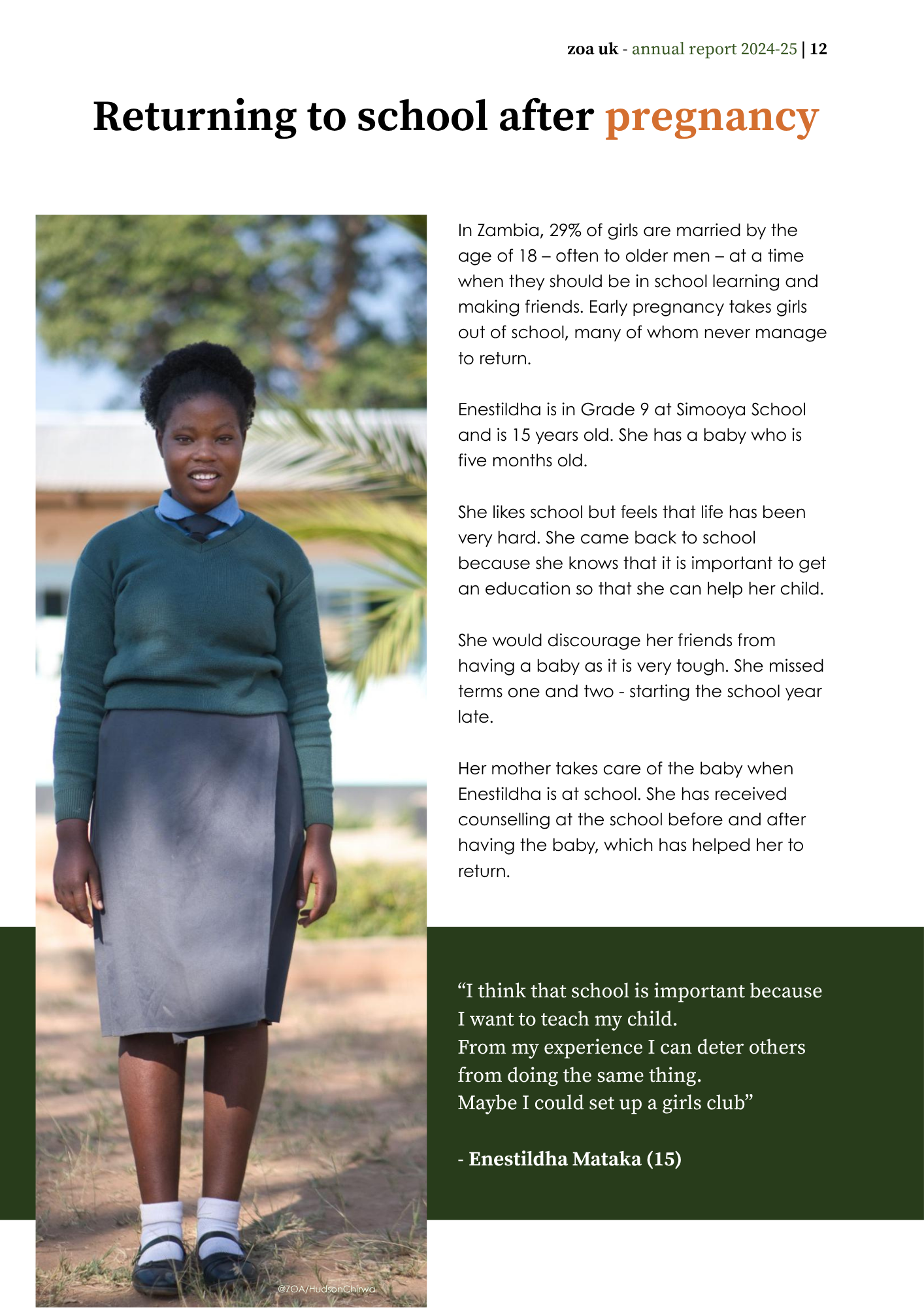
Photos @ZOA/Hudson Chirwa